Welcome to the final post for the Special Topics in GIS course. This last portion is dedicated to the report on Food Deserts that has culminated the last few weeks of preparation and analysis. The overall objective for this project was to explore open source GIS software and web mapping applications to create a simple but custom web map to work in concert with standalone maps generated with other open source GIS software, specifically QGIS.
The culmination of the analysis results is presented in the fully narrated PowerPoint presentation linked below. Additionally, the independent web map, also linked below, is embedded into the presentation.
Central Brevard Food Desert PowerPoint Presentation
Central Brevard Food Desert Interactive Web Map
A brief overview: A food desert is an area in or around a city or urban center that is outside of 1 mile from a grocery store that doesn't offer fresh produce or other whole foods. The lack of these fresh foods can lead to compounding health issues for those who might not have the means to travel farther to grocery stores with them and are stuck with local potentially unhealthy options. My project involved investigating the city of Rockledge, Florida for the presence of food deserts. The data was investigated at the census tract level, looking at the population information from the 2010 census. The center of the census tracts was evaluated to determine those outside of 1 mile from the grocery stores present. These food deserts were then color coded by population distribution highlighting those most impacted. The interactive web map supplements this information by allowing you to a better visual sense of the neighborhood distribution for the area in relation to the census tracts.
Overall, I've really enjoyed this course throughout the past semester. I have learned a lot during the UWF GIS Certificate Program and I hope to use all of my newly found knowledge for whatever is yet to come. I'm looking forward to becoming a Crime Analyst for a local police department at some point, and I'm excited about taking more classes to help me reach that goal.
Thursday, December 8, 2016

Saturday, December 3, 2016
GIS 4930: Special Topics; Project 4: Open Source Analyze 2
This is a continuation of the analysis started last week, which focuses on open source GIS. This week's objectives are to tile shapefiles for internet usage, create a custom basemap with the use of Mapbox, and to utilize web mapping to communicate a subject.
Last week you saw some analysis with pre-made subject matter for the Pensacola area of Escambia County, Florida. Those datasets were already present and being manipulated to discover how to determine areas that are or are not food deserts. These week is about taking my own acquired and generated datasets and feeding them through the processes of making an open source web map. The mediums for this are QGIS, Tilemill, and Mapbox. Mapbox is the new addition to the processing and analysis portions of this week. Specifically tiled layers generated in Tilemill were uploaded to a base map in mapbox.
You can click here to view the Web Map I created for this assignment.
I decided to create a food desert map of my hometown of Rockledge, FL, which is located in Brevard County. To start off, I created a KMZ file with all of the local grocery stores near me, which was created in Google Earth, which was later converted into a shapefile. I took advantage of the Florida Counties shapefile that was provided for us during Prepare Week. Utilizing ArcMap, I was able to clip Brevard County from the Florida County Boundaries shapefile, which provided me with my area of interest. From there, I attempted to create a census layer within QGIS to display the variety of tracts throughout Brevard County. After attempting this task numerous times, I was unable to get the attributes needed to complete the assignment. I ended up downloading the 2010 census tracts from the Florida Geographic Data Library (FGDL). With the newly downloaded census tracts, I was able to add the layer to my map in QGIS and clip it to my county. I also created a Near.csv utilizing the Near tool in ArcMap.
Last week you saw some analysis with pre-made subject matter for the Pensacola area of Escambia County, Florida. Those datasets were already present and being manipulated to discover how to determine areas that are or are not food deserts. These week is about taking my own acquired and generated datasets and feeding them through the processes of making an open source web map. The mediums for this are QGIS, Tilemill, and Mapbox. Mapbox is the new addition to the processing and analysis portions of this week. Specifically tiled layers generated in Tilemill were uploaded to a base map in mapbox.
You can click here to view the Web Map I created for this assignment.
I decided to create a food desert map of my hometown of Rockledge, FL, which is located in Brevard County. To start off, I created a KMZ file with all of the local grocery stores near me, which was created in Google Earth, which was later converted into a shapefile. I took advantage of the Florida Counties shapefile that was provided for us during Prepare Week. Utilizing ArcMap, I was able to clip Brevard County from the Florida County Boundaries shapefile, which provided me with my area of interest. From there, I attempted to create a census layer within QGIS to display the variety of tracts throughout Brevard County. After attempting this task numerous times, I was unable to get the attributes needed to complete the assignment. I ended up downloading the 2010 census tracts from the Florida Geographic Data Library (FGDL). With the newly downloaded census tracts, I was able to add the layer to my map in QGIS and clip it to my county. I also created a Near.csv utilizing the Near tool in ArcMap.
There are not any trends that I can identify at this
point. I’ve lived in Brevard County for
all 25 years of my life, and I did not know some of the areas displayed are
food deserts. Of course, my focus was mainly on Rockledge, which resulted in me
only creating a shapefile for grocery stores near, or within Rockledge,
FL. Even though that may contribute to
the results shown in my webmap, I still think it’s a fairly accurate representation. I think the main thing that surprises me
about the data is how many people live in Brevard County. I had no idea this was such a popular place
to live.
Friday, December 2, 2016
GIS Internship: Portfolio Final
For our final assignment in the certificate program, we were tasked with creating either an online portfolio or a paper/PDF portfolio to present during an interview. The portfolio would tell a little about us, containing our GIS specific resume, and provide some examples of our student or professional GIS work over the last year.
I chose to create an online portfolio since I love everything related to GIS and Graphic Design. The online portfolio is an additional resource, along with my blog and Instagram account that people or organizations could review. I used Wix.com, a free website service that offers a variety of templates, to create my portfolio. The website was very easy to use and fairly intuitive for basic design. I was able to pull my map images from my blog and upload them into Wix. I also provided the appropriate links for each map that lead to the correct blog pages. These links are useful for anyone who may be viewing my portfolio so they can see a more detailed process that went into the creation of the maps provided. To view my final GIS portfolio, please click on the link below.
Final GIS Portfolio
I chose to create an online portfolio since I love everything related to GIS and Graphic Design. The online portfolio is an additional resource, along with my blog and Instagram account that people or organizations could review. I used Wix.com, a free website service that offers a variety of templates, to create my portfolio. The website was very easy to use and fairly intuitive for basic design. I was able to pull my map images from my blog and upload them into Wix. I also provided the appropriate links for each map that lead to the correct blog pages. These links are useful for anyone who may be viewing my portfolio so they can see a more detailed process that went into the creation of the maps provided. To view my final GIS portfolio, please click on the link below.
Final GIS Portfolio
Saturday, November 26, 2016
GIS 4930: Special Topics; Module 4: Open Source Analyze Part 1
This is the first of two weeks of analyze type work. Although this week's effort mostly focused on analyzing how the data would be presented in a few weeks. This was accomplished by utilizing web mapping tools and applications, which is built around presenting maps to the public in an open sourced manner. This week we are transforming some of the prep work created last week into the web forum in preparation of distributing it to the masses. The overall objectives this week are as followed:
1. Navigate through, and add layers to Tilemill
2. Gain familiarity with Leaflet
3. Use tiled layers and plug-ins in a web map
The main theme to all of the above objectives before looking at them individually is that they are open source! That means anyone has the ability to acquire them, learn about them, and in most cases contribute to the community with them.
Tilemill is an interactive mapping software predominately used by cartographers and journalists to create interactive maps for sharing with the public. Leaflet is a javascripting utility which allows you to code html web maps for display, much like the one linked below. The layer tiling mentioned in the last objective was accomplished with some basic html code using Notepad, and shared on a webmapping host.
The Web Map I created displays the end result of this week's efforts. It combines the objectives mentioned above with the data we looked at last week for food deserts in the Pensacola, FL area. Every feature or option on this map falls into one of the objectives above. However, after thoroughly reading through the instructions numerous times, ensuring I didn't skip a step, I was unable to get the tiled layer function to work properly. My legend is visible, however, there is not an option to turn on or off the layers. I think there may have been a step missing from the instructions. Nevertheless, I was able to get the find function to appear in the lower left. The points, polygons, and circle are also very specific. Each of these elements is an individual block or segment of code which was pre-thought out to contribute to the map in this specific manner. This was all done to get familiar with these applications and get ready to present my own specific area exploring food deserts in a couple weeks.
1. Navigate through, and add layers to Tilemill
2. Gain familiarity with Leaflet
3. Use tiled layers and plug-ins in a web map
The main theme to all of the above objectives before looking at them individually is that they are open source! That means anyone has the ability to acquire them, learn about them, and in most cases contribute to the community with them.
Tilemill is an interactive mapping software predominately used by cartographers and journalists to create interactive maps for sharing with the public. Leaflet is a javascripting utility which allows you to code html web maps for display, much like the one linked below. The layer tiling mentioned in the last objective was accomplished with some basic html code using Notepad, and shared on a webmapping host.
The Web Map I created displays the end result of this week's efforts. It combines the objectives mentioned above with the data we looked at last week for food deserts in the Pensacola, FL area. Every feature or option on this map falls into one of the objectives above. However, after thoroughly reading through the instructions numerous times, ensuring I didn't skip a step, I was unable to get the tiled layer function to work properly. My legend is visible, however, there is not an option to turn on or off the layers. I think there may have been a step missing from the instructions. Nevertheless, I was able to get the find function to appear in the lower left. The points, polygons, and circle are also very specific. Each of these elements is an individual block or segment of code which was pre-thought out to contribute to the map in this specific manner. This was all done to get familiar with these applications and get ready to present my own specific area exploring food deserts in a couple weeks.
Friday, November 18, 2016
GIS 4930: Special Topics; Project 4 - Open Source Prep
Welcome to the beginning of the last multi-week module in Special Topics in GIS. The focus for the remainder of the class is on Food Deserts and their increasing proliferation due to urbanization and expansion of the markets/grocers containing wholesome and nutritious foods to include fresh vegetables and fruits as well as other produce. The second large aspect of this project is that all preparation, analysis, and reporting for the focus area will be done using open source software. As the certificate program as a whole draws to a close, it is a good introduction into what is available outside of ESRI's ArcGIS suite of applications. This week I specifically used Quantum GIS (QGIS) to build the base map and do the initial processing of Food Desert data for the Pensacola area of Escambia County, Florida. The overall objectives going into this week are listed below:
1. Perform basic navigation through QGIS
2. Learn about the differences of data processing with multiple data sets and geoprocessing tools in QGIS, while employing multiple data frames and similar functionality.
3. Experience the differences of map creation with the QGIS specific Print Composer
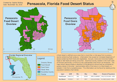
Below is a map not unlike many of the others I have created using ArcMap. That is, in fact, the point of one huge aspect of this project. There is open source, defined as free to use software which you can personally suggest improvements for update and redistribution to the masses. These open source applications perform quite similar tasks and produce similar outputs as those in ArcMap. QGIS is one of these options. Given the background in ArcGIS from the rest of this certificate program, there is not a steep learning curve in picking up QGIS and running with it. There are definitely differences, but with little instruction it becomes very intuitive just like ArcMap. Now you might be wondering, if these two softwares are so similar, then why wouldn't everyone choose QGIS over any ESRI related products? There are still advanced tools and spatial analysis functions in ArcGIS that are beyond this software. For the basic to moderate tasks, they can definitely be done in QGIS. But sometimes there will be no substitute for the processing ease and power of ArcGIS.
Back to the map provided, what you're looking at is two frames, or two sides of the same information. You are presented with both Food Deserts and Food Oasis by census tract for the Pensacola area of Escambia County. These deserts were calculated by comparing the centroid (geographic center) of a census tract with its distance to a grocery store. Tracts without a grocery store providing fresh produce are said to be in a Food Desert. The average person in these areas have to travel further to obtain fruits and vegetables. When doing so, other closer, less healthy alternatives might be taking precedence for these people. Ultimately, those with less access are likely to be less healthy overall and that is the issue we are starting to get into with this subject.
Keep checking for the next installments of analysis as we continue to look at this issue. The area shown below is just for example purposes. As the project moves forward, my analysis and results will focus on Rockledge, Florida, which is located in Brevard County.
1. Perform basic navigation through QGIS
2. Learn about the differences of data processing with multiple data sets and geoprocessing tools in QGIS, while employing multiple data frames and similar functionality.
3. Experience the differences of map creation with the QGIS specific Print Composer
Below is a map not unlike many of the others I have created using ArcMap. That is, in fact, the point of one huge aspect of this project. There is open source, defined as free to use software which you can personally suggest improvements for update and redistribution to the masses. These open source applications perform quite similar tasks and produce similar outputs as those in ArcMap. QGIS is one of these options. Given the background in ArcGIS from the rest of this certificate program, there is not a steep learning curve in picking up QGIS and running with it. There are definitely differences, but with little instruction it becomes very intuitive just like ArcMap. Now you might be wondering, if these two softwares are so similar, then why wouldn't everyone choose QGIS over any ESRI related products? There are still advanced tools and spatial analysis functions in ArcGIS that are beyond this software. For the basic to moderate tasks, they can definitely be done in QGIS. But sometimes there will be no substitute for the processing ease and power of ArcGIS.
Back to the map provided, what you're looking at is two frames, or two sides of the same information. You are presented with both Food Deserts and Food Oasis by census tract for the Pensacola area of Escambia County. These deserts were calculated by comparing the centroid (geographic center) of a census tract with its distance to a grocery store. Tracts without a grocery store providing fresh produce are said to be in a Food Desert. The average person in these areas have to travel further to obtain fruits and vegetables. When doing so, other closer, less healthy alternatives might be taking precedence for these people. Ultimately, those with less access are likely to be less healthy overall and that is the issue we are starting to get into with this subject.
Keep checking for the next installments of analysis as we continue to look at this issue. The area shown below is just for example purposes. As the project moves forward, my analysis and results will focus on Rockledge, Florida, which is located in Brevard County.

Tuesday, November 8, 2016
GIS 4035: Remote Sensing; Week 10: Supervised Image Classification
This week's focus was on supervised classification, particularly with the Maximum Likelihood method. This is a continuation of last week that started the classification discussion with unsupervised classification.
Supervised classification revolves around the creation of training sites to train the software in what to look for when conducting the classification. This is accomplished by creating a polygon type area of spectrally similar pixels. Examples would be dense forest, grassland, or water. Each area has a distinct spectral signature. These signatures are used to evaluate the whole of the image and allow the software to automatically reclassify all matching spectral areas. The overall process is usually in four steps: get your image, establish spectral signatures, run the classification based on the signatures, then reclassify or identify rather what your class schema is.
The process is fairly straightforward with only a couple things to watch out for when establishing the spectral signatures. Being sure to avoid spectral confusion. This is where multiple features exhibit similar spectral signatures. This usually occurs most frequently in the visual bands, and can be avoided by doing a good check using tools such as band histograms or spectral mean plotting which shows you the mean spectral value of one or more bands simultaneously. We can see some of the results of this below, such as the merging of the urban/residential and the roads/urban mix.
The image below shows a Land Use derivative for Germantown, Maryland. It was created using a base image and supervised classification looking for the categories displayed in the legend. This map shows the acreage of areas as they currently exist and is intended to provide a baseline for change. As areas get developed, the same techniques can be used on more and more current imagery to map the change and gauge which land uses are expanding/shrinking most and by how much. This was an excellent introduction to one method of supervised classification, there are many types and reasons to conduct it, but those are for another class.

Supervised classification revolves around the creation of training sites to train the software in what to look for when conducting the classification. This is accomplished by creating a polygon type area of spectrally similar pixels. Examples would be dense forest, grassland, or water. Each area has a distinct spectral signature. These signatures are used to evaluate the whole of the image and allow the software to automatically reclassify all matching spectral areas. The overall process is usually in four steps: get your image, establish spectral signatures, run the classification based on the signatures, then reclassify or identify rather what your class schema is.
The process is fairly straightforward with only a couple things to watch out for when establishing the spectral signatures. Being sure to avoid spectral confusion. This is where multiple features exhibit similar spectral signatures. This usually occurs most frequently in the visual bands, and can be avoided by doing a good check using tools such as band histograms or spectral mean plotting which shows you the mean spectral value of one or more bands simultaneously. We can see some of the results of this below, such as the merging of the urban/residential and the roads/urban mix.
The image below shows a Land Use derivative for Germantown, Maryland. It was created using a base image and supervised classification looking for the categories displayed in the legend. This map shows the acreage of areas as they currently exist and is intended to provide a baseline for change. As areas get developed, the same techniques can be used on more and more current imagery to map the change and gauge which land uses are expanding/shrinking most and by how much. This was an excellent introduction to one method of supervised classification, there are many types and reasons to conduct it, but those are for another class.

Sunday, November 6, 2016
GIS 4930: Special Topics; Project 3: Stats Analyze Week
Welcome to the continuation of our look at statistical analysis with ArcMap. Recall that the theme being explored with statistics is methamphetamine lab busts around Charleston, West Virginia. These past few weeks of analysis have been the bulk of the work for this project. The overall objectives of the analysis portion are to review and understand regression analysis basics, and a couple key techniques. Define what the dependent and independent variables are for the study as they apply to the regression analysis. Perform (multiple renditions) of an Ordinary Least Squares (OLS) regression model. Finally, complete 6 statistical sanity checks based on the OLS model outcomes.
In the previous post, we looked at a big overview of the area that is being analyzed. There are 54 lab busts from the 2004-2008 time frame taken from the DEA's National Clandestine Laboratory data. Decennial census data from 2000 and 2010 at the census tract level was spatially joined to these 54 lab busts. The data was then normalized into a percentage by the census tract into 31 categories for analysis in the OLD model. These 31 categories of data were then fed into the model and systematically removed while analyzing their affect on the model. Ultimately as good of a model as possible was arrived at with some results shown below.

This is a generated output depicting the OLS results created in ArcMap. Key things to note from the table is that there are only nine variables being incorporated into the OLS model of the original 31. How were variables removed you might ask? There are six checks, or questions, to answer to determine the validity of a variable's use in the OLS model: does an independent variable help or hurt the model; is the relationship to the dependent variable as expected; are there redundant explanatory variables; is the model biased; are there variables missing or unexplained residuals; how well does the model predict the dependent variable? The first three of these were generally grouped into one solid check for determining if a variable should stay or go. The remaining checks were applied to the model results as a whole. As long as a variable had a coefficient that wasn't near zero, a probability lower than 0.4, and a VIF less than 7.5, it could stay. After looking at this data table, it's time to transition to the visual interpretation, shown below.

In the previous post, we looked at a big overview of the area that is being analyzed. There are 54 lab busts from the 2004-2008 time frame taken from the DEA's National Clandestine Laboratory data. Decennial census data from 2000 and 2010 at the census tract level was spatially joined to these 54 lab busts. The data was then normalized into a percentage by the census tract into 31 categories for analysis in the OLD model. These 31 categories of data were then fed into the model and systematically removed while analyzing their affect on the model. Ultimately as good of a model as possible was arrived at with some results shown below.

This is a generated output depicting the OLS results created in ArcMap. Key things to note from the table is that there are only nine variables being incorporated into the OLS model of the original 31. How were variables removed you might ask? There are six checks, or questions, to answer to determine the validity of a variable's use in the OLS model: does an independent variable help or hurt the model; is the relationship to the dependent variable as expected; are there redundant explanatory variables; is the model biased; are there variables missing or unexplained residuals; how well does the model predict the dependent variable? The first three of these were generally grouped into one solid check for determining if a variable should stay or go. The remaining checks were applied to the model results as a whole. As long as a variable had a coefficient that wasn't near zero, a probability lower than 0.4, and a VIF less than 7.5, it could stay. After looking at this data table, it's time to transition to the visual interpretation, shown below.

This map depicts the standard residual for the OLS model depicted in the table. It symbolizes areas using a standard deviation style outlook. However, rather than wanting a more Gaussian curve style of data showing some of every color, you ideally want values to be in the +/- 0.5 range because that is said to be highly accurate. Darker browns indicate areas that the model predicted less meth labs actually were. Whereas, darker blues indicate high value areas where the model expected more meth labs than those that were actually present.
This week's focus was not to describe the data results, but to accomplish the analysis leading up to it..
Tuesday, November 1, 2016
GIS 4035: Remote Sensing; Module 9: Unsupervised Classification
This week's assignment revolved around unsupervised classification with remotely sensed imagery. This is a multifaceted lab looking at a number of different processes culminating in the unsupervised classification and manual reclassifying of the resulting raster dataset for a permeability analysis. The main objective was to understand and perform an unsupervised classification in both ArcMap and ERDAS Imagine. Imagery for two different areas was provided, ultimately the UWF area, as seen in the map below, was the final subject matter for exploration of these topics.
Unsupervised classification is a classification method such that a software suite utilizes an algorithm to determine which pixels in the raster image are most like other pixels throughout the image and groups them accordingly. After the software has grouped the various pixels together, it is up to the user to define what the group classes represent. For this type of classification, the software is given certain user defined parameters such as number of iterations to run, confidence or threshold percentage to reach, and sample sizes. These essentially tell the software how long to run, what the minimum "correctly grouped" pixel percentage is, and how many pixels to look at adjusting at a time.
A high definition true color image of the UWF campus was used for the analysis shown below. This entailed performing a clustering algorithm on the true color image to group like pixels together and then export them as a slightly less defined image for storage space and processing speed concerns. The clustering algorithm created 50 classes, or shades of pixels which approximated the true color image. The software was told to produce 50 classes with 95% accuracy overall. Then I manually reclassified each of those 50 original classes into one of 5 labeled classes. I accomplished this by highlighting the pixel shade and reviewing it against the true color image and assigning it to the classes described. Four of the five classes are straightforward and represent what they say, with some possible error. The mixed class, however, represents certain pixel shades applied to different items that represent both permeable or impermeable surfaces. For example, some dead grass showing could show a tan pixel while a tan rooftop could also be showing the same value. So recoding this pixel to be grass or buildings would be wrong for at least some of that cluster of pixels. To account for this the mixed class was created, which is why you can see some rooftops as blue, grassy areas as blue or green and some blue sprinkled throughout.
Overall, this is a fairly course analysis, but it does do a great job of exercising the process and creating likely results.

Unsupervised classification is a classification method such that a software suite utilizes an algorithm to determine which pixels in the raster image are most like other pixels throughout the image and groups them accordingly. After the software has grouped the various pixels together, it is up to the user to define what the group classes represent. For this type of classification, the software is given certain user defined parameters such as number of iterations to run, confidence or threshold percentage to reach, and sample sizes. These essentially tell the software how long to run, what the minimum "correctly grouped" pixel percentage is, and how many pixels to look at adjusting at a time.
A high definition true color image of the UWF campus was used for the analysis shown below. This entailed performing a clustering algorithm on the true color image to group like pixels together and then export them as a slightly less defined image for storage space and processing speed concerns. The clustering algorithm created 50 classes, or shades of pixels which approximated the true color image. The software was told to produce 50 classes with 95% accuracy overall. Then I manually reclassified each of those 50 original classes into one of 5 labeled classes. I accomplished this by highlighting the pixel shade and reviewing it against the true color image and assigning it to the classes described. Four of the five classes are straightforward and represent what they say, with some possible error. The mixed class, however, represents certain pixel shades applied to different items that represent both permeable or impermeable surfaces. For example, some dead grass showing could show a tan pixel while a tan rooftop could also be showing the same value. So recoding this pixel to be grass or buildings would be wrong for at least some of that cluster of pixels. To account for this the mixed class was created, which is why you can see some rooftops as blue, grassy areas as blue or green and some blue sprinkled throughout.
Overall, this is a fairly course analysis, but it does do a great job of exercising the process and creating likely results.

Wednesday, October 19, 2016
GIS 4035: Remote Sensing; Week 8: Thermal and Multispectral Analysis
This week's assignment was designed to focus on being able to compose a series of different raster bands into a composite image utilizing both ERDAS Imagine and ArcMap. A couple different images were provided by UWF to exercise these skills and to ultimately come up with a user derived analysis of some particular feature.
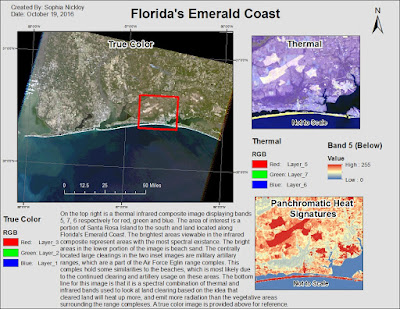
The map shown below is a thermal overview of Florida's Emerald Coast. The image, provided by UWF, dates back to February of 2011. The main map is a True Color image displaying an overview of where the two inset maps are located. The central feature of the two inset images is a large oblong clearing. A clearing is one of many available military firing ranges located along the panhandle. The main objective of this assignment was to try and differentiate the area of interest from it's surroundings using thermal imagery. The purple image, located in the top right, comes from a unique combination of infrared both short wave and thermal bands to provide brightness to the "hottest" areas. These are areas that heat up and/or emit the best. You can see that there is a very similar spectral pattern all along the island to the south. Santa Rosa Island is made up of white sand beaches and dunes and appears as the only feature that might be spectrally similar to the artillery ranges. The color inset, located on the bottom right, is another infrared look at the area, but rather a grayscale color has been used to help give characteristic spectral pattern to the other images.
The map shown below is a thermal overview of Florida's Emerald Coast. The image, provided by UWF, dates back to February of 2011. The main map is a True Color image displaying an overview of where the two inset maps are located. The central feature of the two inset images is a large oblong clearing. A clearing is one of many available military firing ranges located along the panhandle. The main objective of this assignment was to try and differentiate the area of interest from it's surroundings using thermal imagery. The purple image, located in the top right, comes from a unique combination of infrared both short wave and thermal bands to provide brightness to the "hottest" areas. These are areas that heat up and/or emit the best. You can see that there is a very similar spectral pattern all along the island to the south. Santa Rosa Island is made up of white sand beaches and dunes and appears as the only feature that might be spectrally similar to the artillery ranges. The color inset, located on the bottom right, is another infrared look at the area, but rather a grayscale color has been used to help give characteristic spectral pattern to the other images.

Monday, October 17, 2016
GIS 4930: Special Topics; Project 3: Stats Prepare
Throughout the next few weeks, we will be delving deep into the clandestine, the dangerous and ultimately bad world of drugs. Specifically we will be examining the role of GIS statistical analysis as it applies to aiding law enforcement with determining ideal locations to find methamphetamine labs. Meth has been around since the early 1920's and have been illegal since the 60's, which drove the illicit trade underground. Meth labs have been found in every state, but surprisingly only in about half of the country's counties. Over the next few weeks, we will be analyzing two different counties of West Virginia, Putnam and Kanawha. These counties are credited with 187 meth lab busts from 2004-2008. Chances are, we all know someone who has been impacted through drugs, or drug use, or at minimum you can see it all too prevalent on the news. The idea behind this lab is to examine the socioeconomic trend information that can aid in determining where meth labs are most likely and be able to give that information to local law enforcement agencies. The end deliverable for this year will be a scientific paper discussing the issue and analysis being done on the study area shown below.
As stated earlier, the study area is of the Charleston vicinity in West Virginia and is home to 187 meth lab busts. This information has already been summarily broken down into a meth lab density by census tract shown in the main map provided below. This essentially means the total number of busts per census tract was divided by the area of the tract to provide us with density values seen in the legend. This map also provides a basic overview of the subject counties and provides state context as well.

As stated earlier, the study area is of the Charleston vicinity in West Virginia and is home to 187 meth lab busts. This information has already been summarily broken down into a meth lab density by census tract shown in the main map provided below. This essentially means the total number of busts per census tract was divided by the area of the tract to provide us with density values seen in the legend. This map also provides a basic overview of the subject counties and provides state context as well.

Sunday, October 16, 2016
GIS 4035: Remote Sensing; Week 7: Multispectral Analysis
This week's focus revolved around multispectral analysis through spectral enhancement. Essentially this means to take existing spectral data and present it in a manner that might bring out certain relationships or patterns not readily present in other presentations. The main objective for this assignment was to study an image set and identify certain spectral relationships that aren't readily seen looking at a standard true color image. This is accomplished by manipulating the pixel values to show other relationships through gray scale panchromatic views of single spectral bands or different combinations of multiple bands such as that seen from a standard false color infrared image. Both ERDAS Imagine and ArcMap were used to explore the image provided. Several tools within ERDAS were used, such as the Inquire Cursor to look at particular groups of pixels for their relevant brightness information. Histograms and contrast information were utilized to identify patterns within multispectral and panchromatic views of one or more spectral bands. The image shown in all three maps below was provided by UWF. This week's assignment required us to identify three different sets of unique spectral characteristics present within the image and to build maps displaying our results. These results are shown below.

The first criteria involved locating the feature in spectral band 4 that correlates to a histogram spike in value between 12 and 18. Band 4 is generally associated with near infrared (NIR) energy and is good for looking at vegetation and soil and crop land and water contrasting. With this task, I needed to look at the histogram and find the resulting spike, which is shown in the lower right of the image displayed below. From there, I specifically made this the only “visible” feature in the map. Both images shown on the left are using band 4, which proves that the water does stand out quite significantly.

The second criteria involved locating a feature that represents both a spike in the visual and NIR bands with a value around 200, and a large spike in the infrared layers of bands 5 and 6 around pixel values 9 to 11. The main features of this image are displayed in a false natural color employing bands 5, 4, 3. This combination of colors does particularly well at letting the areas that are being inquired about be displayed. I’ve also created insets to display the different extents of the same data in different spectral scenes. The two separate breakdowns of pixels of value 200 in visual bands and values 9-11 in the infrared bands are compared on the lower right.


The second criteria involved locating a feature that represents both a spike in the visual and NIR bands with a value around 200, and a large spike in the infrared layers of bands 5 and 6 around pixel values 9 to 11. The main features of this image are displayed in a false natural color employing bands 5, 4, 3. This combination of colors does particularly well at letting the areas that are being inquired about be displayed. I’ve also created insets to display the different extents of the same data in different spectral scenes. The two separate breakdowns of pixels of value 200 in visual bands and values 9-11 in the infrared bands are compared on the lower right.

The third, and final, criteria revolves around water features in
which viewing bands 1-3 become brighter than usual, but remain relatively
constant in bands 5 and 6. A true, or natural color, image is shown on the upper right. Looking at this image, you can see a river in the upper right portion that is much darker than the water ways featured in the other images. The image shown adjacent to the natural color photo is a custom combination of bands 6, 3, 2 to focus
the brightening of the inlet/bay feature while not pronouncing the IR energy in
the same ways as the typical false color IR, which is shown in the lower right corner. Extent indicators were used to show
the different looks at the specified band and pixel value combinations
identified. A gray scale image was
created to reflect band 3 which shows the largest brightening values.
This assignment wasn't easy, since it involves many concepts I'm still trying to understand. However, I feel as though I've learned some new things throughout this week's assignment. I'm looking forward to learning more throughout the remainder of the semester.
Friday, October 14, 2016
GIS 4930: Special Topics - Module 2: MTR Report
Honestly, I absolutely hated this MTR assignment. Throughout these past couple of weeks, we were supposed to be working as a group to complete the final project. Even though I signed up for a group, I felt like I wasn't a part of one. I would ask the group leader questions but would not receive a response in a timely manner. Basically, I felt like I was "out of the loop" throughout the entire assignment. If I had any extra time to work on this assignment, I would most definitely start from the beginning. I'm really disappointed with the decisions I made in regards to Non-MTR and MTR during the Analyze week a few weeks back.
Wednesday, October 12, 2016
GIS 4035: Module 6 - Spatial Enchancement
This week's lab assignment was centered on working within ERDAS Imagine and utilizing the Fourier Analysis tools, the Convolution tool, and the Focal Statistics tool (found in ArcMap). The project required us to work with a Landsat image that has bands running horizontally across. The tools named above were required in order to minimize the banding to the greatest extent possible without losing too much detail in the image. The assignment was built for us to experiment with the different tools in ERDAS, as well as learn how to use them in getting better results.
In performing this exercise, I used all types of combinations using the tools previously listed in an attempt to remove the strips in the image. The image shown below is the result of using the Fourier Transformation Editor tool and the Convolution of a 3x3 Low Pass kernel. I made sure to finish by adjusting the histogram of the image for better visualization. My results aren't 100% perfect, since the bands are still visible from the left side of the imagery. However, the right side looks pretty good. If I had more time, I would definitely experiment with the different tools in an attempt to get the final result to balance out. Overall, I enjoyed this assignment. It was definitely challenging, but I feel as if I've learned some new things along the way.

In performing this exercise, I used all types of combinations using the tools previously listed in an attempt to remove the strips in the image. The image shown below is the result of using the Fourier Transformation Editor tool and the Convolution of a 3x3 Low Pass kernel. I made sure to finish by adjusting the histogram of the image for better visualization. My results aren't 100% perfect, since the bands are still visible from the left side of the imagery. However, the right side looks pretty good. If I had more time, I would definitely experiment with the different tools in an attempt to get the final result to balance out. Overall, I enjoyed this assignment. It was definitely challenging, but I feel as if I've learned some new things along the way.

Sunday, September 25, 2016
GIS 4930: Special Topics; Project 2: MTR Analyze
This week we were tasked with classifying areas of Mountaintop Removal (MTR) and NonMTR on four landsat images for our group's study site. There are four groups to sign up for in which I decided to become a part of Group 1. The fact that there are four landsat images and four members in my group, we all took responsibility for classifying one image.
The first step was to create a single raster dataset of seven landsat bands that pertained to my image with the Composite Bands tool in ArcMap. Next, the Extract by Mask tool was used to create a raster of portion of the composite landsat that fell within the study area. At this point, the image was ready to be classified into two categories: MTR and NonMTR. This step was accomplished by using a new software known as ERDAS. Within ERDAS, the Unsupervised Classification tool was selected, creating 50 classes from the masked image. Following this, the MTR and NonMTR pixels were selected and titled as such in the attribute table. I then saved the layer and added it into ArcMap. The raster was then reclassified with all areas other than the MTR areas as No Data. This was then converted into a polygon. My results from this assignment are shown below.
River banks, roads, and flat mountainous regions have similar spectral reference characteristics as MTR sites, so a portion of the red area is not accurate. This will be corrected next week during the Report Week assignment.

The first step was to create a single raster dataset of seven landsat bands that pertained to my image with the Composite Bands tool in ArcMap. Next, the Extract by Mask tool was used to create a raster of portion of the composite landsat that fell within the study area. At this point, the image was ready to be classified into two categories: MTR and NonMTR. This step was accomplished by using a new software known as ERDAS. Within ERDAS, the Unsupervised Classification tool was selected, creating 50 classes from the masked image. Following this, the MTR and NonMTR pixels were selected and titled as such in the attribute table. I then saved the layer and added it into ArcMap. The raster was then reclassified with all areas other than the MTR areas as No Data. This was then converted into a polygon. My results from this assignment are shown below.
River banks, roads, and flat mountainous regions have similar spectral reference characteristics as MTR sites, so a portion of the red area is not accurate. This will be corrected next week during the Report Week assignment.

Friday, September 23, 2016
GIS 4035: Remote Sensing; Module 5a: Intro to ERDAS
This week we were given the opportunity to explore a new software known as, ERDAS Imagine. In doing so, we learned some of the basic tools within the software. Those tools include how to use and navigate around the Viewer with two different types of satellite images. We also learned how to add a new column in the image attribute table. On top of that, we learned how to create a subset from the image provided, which is shown below. We were then able to create a map in ArcGIS using our subset image, which was created in ERDAS Imagine. In the map shown below, you can see the various classes and their area (as shown in meters).
I really enjoyed this assignment because I was able to explore the capabilities of a new software. I succeed at learning new softwares, and all of their tools and functions. Being a quick learner, I have the ability to learn new softwares within 1-2 days. I enjoy exploring new softwares not only because it's interesting, but it also makes me more valuable.

I really enjoyed this assignment because I was able to explore the capabilities of a new software. I succeed at learning new softwares, and all of their tools and functions. Being a quick learner, I have the ability to learn new softwares within 1-2 days. I enjoy exploring new softwares not only because it's interesting, but it also makes me more valuable.

Sunday, September 18, 2016
GIS 4930: Special Topics; Project 2 - MTR Prep
The next few weeks will be spent looking at Special Applications in GIS that can be used to analyze mountain top removal (MTR). MTR and valley filling are a common practice most particularly dealing with coal mining. The Appalachian Mountain chain in the mis-eastern United States is an area that is particularly affected with this form of mining. The mining essentially involves peeling away the surface of the earth including trees, brush, soil to get at the rocky layer beneath to harvest away the precious coal. This is the premise of the project throughout the next few weeks. The first part of week's assignment was to create a basemap for the study area that I will be exploring during these next few weeks. The project as both an individual and group component. Deliverables, like the basemap shown below, still have to be done independently. However, much of the upcoming analysis will be broken down into manageable chunks to be completed in groups resulting in a final group presentation.
The basemap below provides an overview of the study area, and displays the DEM, streams, and basin for Group 1, which is the group I have chosen to work with. Many things have been done to the original DEM layer to show the elevation, streams, and basins as shown below. Essentially, a mosaic raster was made out of 4 DEM sections, which was then clipped to the study area. From there, multiple tools were applied to the mosaic to generate the streams and basins. Using the Fill tool, I was able to fill the holes in the pixel database. This makes it so when running a subsequent flow analysis, there aren't holes for the "flowing water" to go into. Flow direction is applied to see how and where water would or should move given the overall contours of the elevation slopes. From there, a calculation is ran to determine what actually correlates to a running stream. This calculation funnels into a conditional statement tool identifying areas that should be streams. Finally, a feature class is created from that entire process and then displayed appropriately.
We were also asked to create a Map Story, which displays the six stages of mountaintop removal. We were also asked to create a Story Map Journal, which is the building blocks in progress towards a final compilation for the project.

The basemap below provides an overview of the study area, and displays the DEM, streams, and basin for Group 1, which is the group I have chosen to work with. Many things have been done to the original DEM layer to show the elevation, streams, and basins as shown below. Essentially, a mosaic raster was made out of 4 DEM sections, which was then clipped to the study area. From there, multiple tools were applied to the mosaic to generate the streams and basins. Using the Fill tool, I was able to fill the holes in the pixel database. This makes it so when running a subsequent flow analysis, there aren't holes for the "flowing water" to go into. Flow direction is applied to see how and where water would or should move given the overall contours of the elevation slopes. From there, a calculation is ran to determine what actually correlates to a running stream. This calculation funnels into a conditional statement tool identifying areas that should be streams. Finally, a feature class is created from that entire process and then displayed appropriately.
We were also asked to create a Map Story, which displays the six stages of mountaintop removal. We were also asked to create a Story Map Journal, which is the building blocks in progress towards a final compilation for the project.

Saturday, September 17, 2016
GIS 4035: Remote Sensing; Week 4 - Ground Truthing
This week we continued with the Land Use and Land Cover map that was created last week. This assignment was focused on ground truthing, which entails a personal visit to sites in the field to verify the land use or land cover located at a given location. There are three different types of ground truthing and those as followed: 1.) In-situ data collection used to identify and guide range of variability of classification/interpretation; 2.) In-situ data collection used to conduct an accuracy assessment to verify that classification/interpretation is correct; and 3.) In-situ collection using a hand held field spectrometer. For this exercise, we used the second method of ground truthing. Thirty sample points were randomly selected to show ground truth. With the help of Google Maps, I was able to identify whether those sample points were true or false. The green points shown below are marked as "True", which means the street view from Google Maps indicates the same LULC as my map's classification. The red points shown below are marked as "False", which means that location is found to have a different use, or cover.


Friday, September 16, 2016
GIS 4930: Special Topics - Project 1: Network Analyst Results
In
preparation for Hurricane Oscar, four products were created to help the
community. The target audience does not
have a GIS background. The first product
communicates evacuation routes from Tampa General Hospital to two local
hospitals, Memorial Hospital and St. Joseph’s Hospital. An informative pamphlet was developed for
distribution to patients and their families.
The pamphlet includes a plan showing two evacuation routes, evacuation timing,
emergency contacts, as well as location details of each hospital. The pamphlet is designed to inform patients
and their families on the evacuation process.
Evacuation
routes were created utilizing Network Analyst within ArcMap. Data was retrieved from the University of
West Florida, Florida Division of Emergency Management, and the Florida Geographic
Data Library. Directions for both
destinations were extracted using the Network Analyst function within ArcMap.
The pamphlet
clearly depicts evacuation routes and other important information, however, it
does not include local shelters near the destination hospitals. It also doesn’t provide alternate routes for
family members coming from major highways.
Regardless, this pamphlet would give me confidence that the hospital was
taking good care of my loved one.
The
second product communicates emergency supply routes to the delivery crew and
emergency workers. Grayscale maps were
developed showing the distribution of emergency supplies by the U.S. Army National
Guard to the three local storm shelters: Tampa Bay Blvd Elementary, Middleton
High School, and Oak Park Elementary.
These three maps serve as an emergency supply route plan, with detailed
directions for each location.
Using
Network Analysis, three separate maps were created to provide detailed
information showing the routes from the U.S. National Guard Armory to the three
local storm shelters. The routes have
been divided into several linear sections to provide drivers with a clear
understanding. Directions were extracted
using the Network Analyst function within ArcMap. An inset map provides an overview of the
detailed routes.
While
the maps are affective in providing navigation details, they do not include
contact data or timing on when supplies should be delivered. The maps also don’t include addresses of the
starting or destination points.
Regardless, they are adequate for their intended purpose.
The
third product displays multiple evacuation routes from downtown Tampa to the
nearest local shelter, and is intended for distribution by television and
newspapers. Close up images of the
routes are provided, as well as an inset map displaying the full route. Text advises drivers on general
precautions.
Using
Network Analysis and Adobe Illustrator, routes were created from 15 zones to
the shelter. Color codes help the public determine the recommended route. Streets and major roads along the routes are
labeled accordingly and arrows provide directional information.
While
the map clearly depicts the evacuation routes for the downtown Tampa Bay area,
it does not provide detailed driving directions, contact information, or the
address of the shelter destination. Nevertheless,
local residents should be able to find the evacuation routes. The map shown below displays the emergency supply route from the National Guard Armory to the Oak Park Elementary Shelter.

The
fourth product, as shown below, depicts shelter locations and will be distributed to the general
public by television and newspapers. The
area is divided into three zones, each with a designated shelter. Informational text lists the shelter names,
addresses, predictions on hurricane landfall, and safety precautions in the
event of flooding.
ArcMap
was used to create the map showing the zones and shelter locations. Major state roads and highways were labeled
accordingly. Illustrator was used to make
it aesthetically pleasing and add textual information.
The map serves
its purpose in communicating the nearest shelter locations to the general
public. It would be helpful to provide
contact information for the three shelter locations.

Overall, I really enjoyed this first project and am pleased with how all of my maps turned out. However, the creation of the maps depicting the four different scenarios was extremely time consuming. Nevertheless, I'm looking forward to creating more maps throughout the upcoming projects.


Tuesday, September 13, 2016
GIS 4035: Remote Sensing - Week 3: LULC
This week we learned all about the classifications and codes of land use and land cover. Land use refers to how land is being used by human beings. Land cover refers to the biophysical materials found on the land. In the map shown below, you'll notice that I used mostly level II classifications, with the exception of
a few codes taken from the level III classification scheme. The level II codes that were used are as followed: 11
for Residential, 12 for Commercial and Services, 13 for Industrial, 41 for
Deciduous Forest, 43 for Mixed Forest, 52 for Lakes and 54 for Bays and Estuaries. The code descriptions are all two digits to
signify second level classification.
Whereas, with third level classification, the code descriptions are all three
digits. The level III codes I used are
as followed: 111 for Trailer Parks, 121 for Retail, 122 for Schools, 144 for
Highway, and 171 for Cemetery.

After reviewing my final product, and looking over all of the
codes to ensure I hadn’t forgotten anything, I realized I should have used code
61 (Forested Wetland) instead of 43 (Mixed Forest) for the swampy areas.
This project was a lot more time consuming than I ever thought it would be. It took me all weekend just to draw all of the polygons. Besides that, I really enjoyed this assignment and I love the outcome.

Friday, September 9, 2016
GIS 4930: Special Topics - Week 2: Analyze
After
creating a basemap of the study area and determining the potential flood zones,
an evacuation route map was created based on four different scenarios. Using the Network Analyst toolbar in ArcMap,
I was able to define optimal evacuation routes to allow the transfer of
patients from one hospital to another, deliver emergency supplies to shelters,
transfer citizens to the nearest shelter location, and finding the nearest
shelter for local residents.
The fourth, and final, scenario shows residents
which of the three shelters is closest to them by drive time. The objective in finding the nearest shelter
is to aid residents in getting to their designated shelter as quickly as
possible and help alleviate confusion.
This was achieved by creating a New Service Area within the Network
Analyst toolbar. The area surrounding
Tampa Bay Blvd Elementary is shown in light green, the area surrounding
Middleton High School is shown in light red, and the area surrounding Oak Park
Elementary is shown in light yellow.

The first
scenario mentioned is the evacuation of patients from Tampa General Hospital on
Davis Islands. The hospital is located
at the northern tip of Davis Islands, a small, residential area that was
created with sediments dredged during the creation of the nearby canals. Due to the very low elevation of the islands,
the hospital will almost certainly be subjected to heavy flooding during the
coming storm. A route was created to
evacuate all patients to other local hospitals before the hurricane hits. The hospitals that were chosen to accept
patients is the Memorial Hospital of Tampa and the St. Joseph’s Hospital. These two routes were created by using the
Network Analyst toolbar and ensuring that the Impedance was set to Seconds for
calculating the routes.
The second
scenario displays the distribution of emergency supplies by the U.S. Army
National Guard to three storm shelters.
Emergency supplies will be delivered to the U.S. Army National Guard
armory, located at Howard Ave. and Gray St. on the west side of the river. Once the supplies reach the armory, National
Guard troops will be tasked with delivering the supplies to the local storm
shelters. However, the supplies may not
reach the armory before the storm hits, so drivers will have to travel to the
shelters while avoiding flooded roadways.
Three new routes were created to assist the drivers and the National
Guard troops to safely deliver emergency supplies to the shelters (Tampa Bay
Blvd, Middleton High School, and Oak Park Elementary). These routes were created using the same
tools used in scenario one.
The third
scenario displays the creation of multiple evacuation routes for downtown
Tampa. Since the downtown area of Tampa
is heavily populated, routes were created to assist the general public in
evacuating to the nearest shelter location as quickly as possible. This was accomplished by using the Scaled
Cost function, which works by multiplying the Impedance attribute by the Scaled
Cost attribute. A New Closest Facility
was created using the Network Analyst toolbar.
Using this, I was able to classify a point layer as Incidents, which
shows all of the locations in downtown Tampa that need to be evacuated. As shown in the map attached, the final
destination for all evacuation routes is the Middleton High School shelter.

Subscribe to:
Posts (Atom)