This past week we learned how to manipulate tools in ArcMap by using Python. Shown below are the results of using three different tools: AddXY, Buffer, and Dissolve. I was able to add XY coordinates to the attribute table of the hospitals.shp layer by using the AddXY tool. I also created a 1000 meter buffer around the hospital features using the buffer tool. And finally, I learned how to use the dissolve tool which dissolves the hospital buffers into a separate, single feature. I also managed to enable overwrite output so can continue to run the script, even if the file exists. Last but not least, I printed the messages using the GetMessages() tool, which is what's shown below.
I enjoyed this assignment because it was pretty easy to comprehend and it wasn't that difficult. I feel like I'm beginning to understand Programming more and more as the class goes on. I'm looking forward to learning more tools and different scripts.
Wednesday, June 22, 2016
Sunday, June 19, 2016
GIS 4048: Week 5 - HLS DC Crime Mapping
This week's assignment was like a dream come true. I have always loved law enforcement with a huge passion and have always been so fascinated and curious by everything they do. When it comes time for me to find a new job, I'm strongly considering becoming a crime analyst for a local police department. The assignment this past week was to create a map showing the crime occurrences in relation to local police departments within Washington DC. We were also asked to create a map showing the crime density for burglaries, sexual abuse, and homicides in the DC area.
The map shown below portrays the total crime in relation to local police departments. The different types of crime are listed and color coded based on their severity. Theft, being the most common, is also the least violent. You could also find out that information by referring to the graph in the lower left of the map. The graph shows the number of crimes committed and the severity of those crimes. The police stations are shown using graduated symbols, which represent the percent of crimes by those departments. I displayed the block groups by use of graduated colors and a Natural Breaks classification method. The different colors represent the population density throughout Washington DC.
I strongly debated on showing the different crimes on the map because I felt it looked too cluttered. However, since I was asked to provide the map with a proposed police station, I thought it best to include the crime layer. That way, you're able to see the severity of crimes in relation to the proposed police stations.
Overall, I really enjoyed this assignment. It gave me an idea as to what I might accomplish as a Crime Analyst. I found this assignment to be one of the most fascinating ones, yet. On top of it all, I got to learn how to use a new tool. I don't think there were any huge challenges for me this past week. However, the map displaying the crimes in relation to the police departments took a lot longer than expected. I'm really looking forward to seeing the rest of the Homeland Security assignments, and seeing what else I can do.
The map shown below portrays the total crime in relation to local police departments. The different types of crime are listed and color coded based on their severity. Theft, being the most common, is also the least violent. You could also find out that information by referring to the graph in the lower left of the map. The graph shows the number of crimes committed and the severity of those crimes. The police stations are shown using graduated symbols, which represent the percent of crimes by those departments. I displayed the block groups by use of graduated colors and a Natural Breaks classification method. The different colors represent the population density throughout Washington DC.
I strongly debated on showing the different crimes on the map because I felt it looked too cluttered. However, since I was asked to provide the map with a proposed police station, I thought it best to include the crime layer. That way, you're able to see the severity of crimes in relation to the proposed police stations.
The map shown below represents crime density showing burglary, sexual abuse, and homicide within Washington DC. These maps were created using a search radius of 1500 in the Kernel Density tool. The density analysis portrayed are based on the following counts of each offense. Burglary: 339 cases, Sexual Abuse: 15 cases, and Homicide: 9 cases. The density shading is also overlaid over a population density by square mile. As you can see, burglaries are very much higher in concentration around the more densely populated area. This is still true for sex crimes, however these increase to the mid and mid east DC areas. Homicides, on the other hand, are less frequent and are less centrally located.
Wednesday, June 15, 2016
GIS 4102/5103: Week 5 - Geoprocessing in Arc
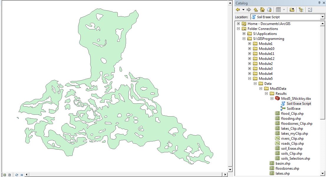
This past week I have been learning how to use geoprocessing within ArcMap. I learned how to create a new toolbox and I was able to better my skills within the ModelBuilder. Using the ModelBuilder, I was able to create a new output shapefile, as shown below. I also became acquainted with converting the model into a script. Overall, this assignment really wasn't too hard. I feel like I'm finally starting to understand the language. I'm looking forward to learning more throughout the rest of thee semester.
Saturday, June 11, 2016
GIS 4048: Week 4 - Hurricanes
In the immediate hours after a hurricane's landfall, there is a need for damage assessment. This past week I got to work as a GIS technician for a major university, in which I have been contracted by a private company to digitize/assess damage caused by Hurricane Sandy at the site level. In doing so, I created a map showing Hurricane Sandy's track history during the month of October in 2012. Looking at the map, you'll notice that the states that are most impacted are shown in yellow with a green diagonal line. The rest of the states are shown in grey. By tracking Hurricane Sandy, you can see the mile per hour winds and the Bar. Pressure.
I also created a map showing the property damage caused by the tropical storm. The image at the top of the map, located below, shows the imagery before the storm hit. Looking at the bottom imagery, you'll notice how much damage was caused by the storm. You'll also see that there are different points in the bottom imagery. Those points represent the property damage. You'll notice that the buildings that are closest to the water have more of an impact than those further away from the water. I also provided two inset maps showing the location of the Damage Assessment Area.
Overall, I really enjoyed creating these two maps. I learned multiple new tools this past week, and I'm looking forward to learning more. The creation of these two maps went pretty smoothly for the most part. I did have one challenge, however. Upon the creation of my first map, I think I messed up the projections somehow, which caused me to start from scratch. Fortunately, it was only a small hiccup and I was able to complete everything in a day's work.
Wednesday, June 8, 2016
GIS 4102/5103: Week 4 - Debugging and Errors
This past week focused on Debugging and Errors. We had to ensure that three different scripts would run properly, without any errors. I think it's fairly easy to be able to find and locate different errors and be able to correct them. In the first image located below, we were given instructions to correct the two errors/exceptions located within the script. After doing so, the script should successfully print the names of all of the fields in the parks.shp attribute table. In the second script provided, there were eight errors/exceptions which needed to be fixed. As seen in the second image below, the script successfully prints out the names of all the layers within the data frame. Finally, the third script provided contained errors that were preventing it from running. Rather than fixing those errors, we were asked to use a try-except statement. I struggled with this part of the assignment, a little bit. I was unsure where to place the try-except statements. But fortunately, I was able to figure it out and run the script without getting any error messages. In the third image below, Part A prints an error statement stating the problem. Whereas Part B encountered no errors and successfully printed out the Name, Spatial Reference, and Scale of the data frame.
Saturday, June 4, 2016
GIS 4048: Week 3 - Tsunami
This past week we focused on tsunami evacuation zones in Japan. In the image below, you'll notice a multiple ring buffer which shows the nuclear evacuation zones. The enlarged inset map provides a look at the coastline as well as the tsunami evacuation zones. I also provided another inset map which shows the vicinity of Japan. You'll also notice that on the lower right side of the map, there's a table explaining the radiation effects.
I became reacquainted with the Multiple Ring Buffer when creating the Nuclear Evacuation Zones. I was also able to get more practice with the model tool to create the three tsunami evacuation zones.
The only challenge I really faced during this assignment was converting the .xls file into a shapefile. My mind went completely blank when I tried to complete that task. Fortunately, I was able to figure it out. Overall, I really enjoyed this assignment. I love putting maps together and seeing the end result.
I became reacquainted with the Multiple Ring Buffer when creating the Nuclear Evacuation Zones. I was also able to get more practice with the model tool to create the three tsunami evacuation zones.
The only challenge I really faced during this assignment was converting the .xls file into a shapefile. My mind went completely blank when I tried to complete that task. Fortunately, I was able to figure it out. Overall, I really enjoyed this assignment. I love putting maps together and seeing the end result.
Wednesday, June 1, 2016
GIS 4102/5103: Python Fundamentals Part II
This assignment took a lot longer than expected. This past week, we practiced using the while loop, the if statement, along with some other functions. We were asked to create a list of 20 random integers between 0-10, which you'll find in the image below. That list was created using the while loop and the .append function. And then we were asked to remove an unlucky number from that previously created list. I was unable to figure out the .remove function, so instead I used the if and else statements followed by the while loop.
This assignment was definitely a challenge for me. The most difficult part for me is understanding the language. But I'm hoping to learn more and be able to understand everything as the semester goes on.
Subscribe to:
Posts (Atom)